Why Mobile Matters More Than Ever
As of 2025, over 70% of all web traffic comes from mobile devices. That means your website isn’t just being visited on desktops—it's being swiped, tapped, and scrolled on phones and tablets daily. If your site isn’t mobile-friendly, you're already behind.
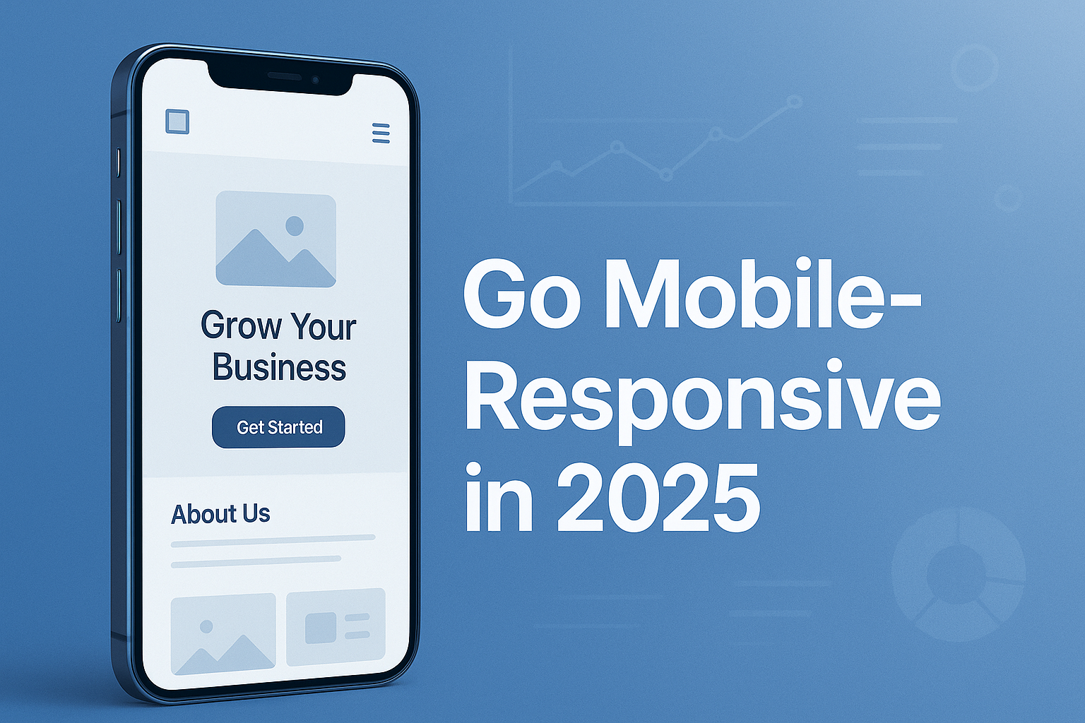
What Is a Mobile-Responsive Website?
A mobile-responsive website adjusts its layout, font sizes, buttons, and overall content dynamically to fit any screen size. From a 6-inch phone to a 13-inch tablet, everything looks perfect—no pinching, zooming, or broken layouts.
Key Benefits of Going Mobile-Responsive:
-
🔹 Improved User Experience
Visitors won’t bounce off your site if it loads fast, looks clean, and is easy to navigate on mobile.
-
🔹 SEO Boost
Google prioritizes mobile-friendly websites in search rankings—especially since its switch to mobile-first indexing.
-
🔹 Increased Conversions
People are shopping, booking services, and filling out forms on their phones. If it’s seamless, they’re more likely to take action.
Are You Mobile-Ready for 2025?
With 5G expansion, higher expectations, and competitive benchmarks, your customers won’t tolerate slow or broken mobile pages. You don’t just need a website—you need one that performs flawlessly on mobile.